Artist Alley Applications Platform
Simplifying the process for artists to apply for a booth at their local anime convention
Simplifying the process for artists to apply for a booth at their local anime convention
UX/UI + User Research + Content Strategy
This is my Graduation Project for Emily Carr University. This is a
2 part project.
1. Making artist alley applications easier
2. Helping organizers to manage artist alley applications better
You can view
organizer side here
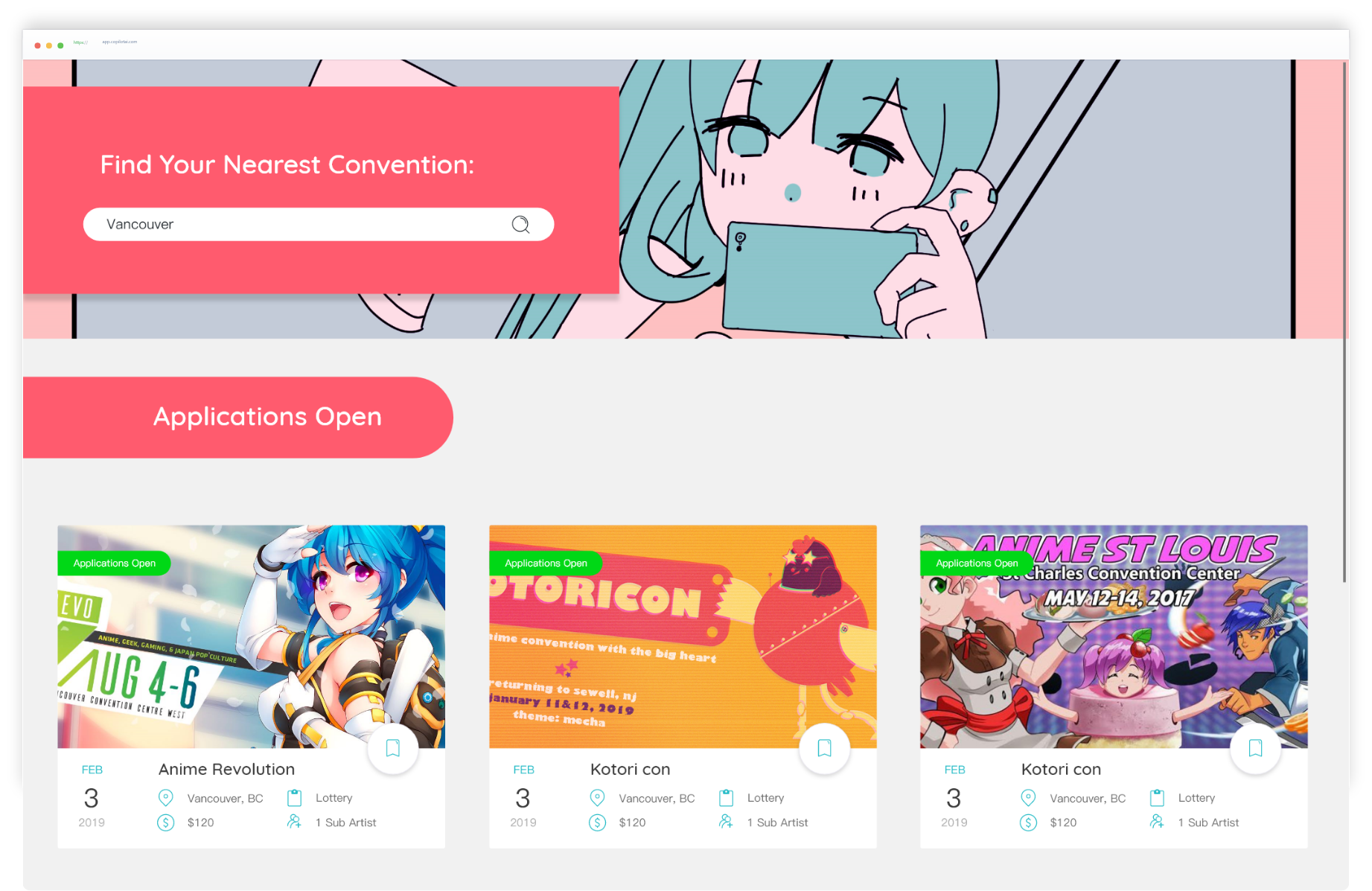
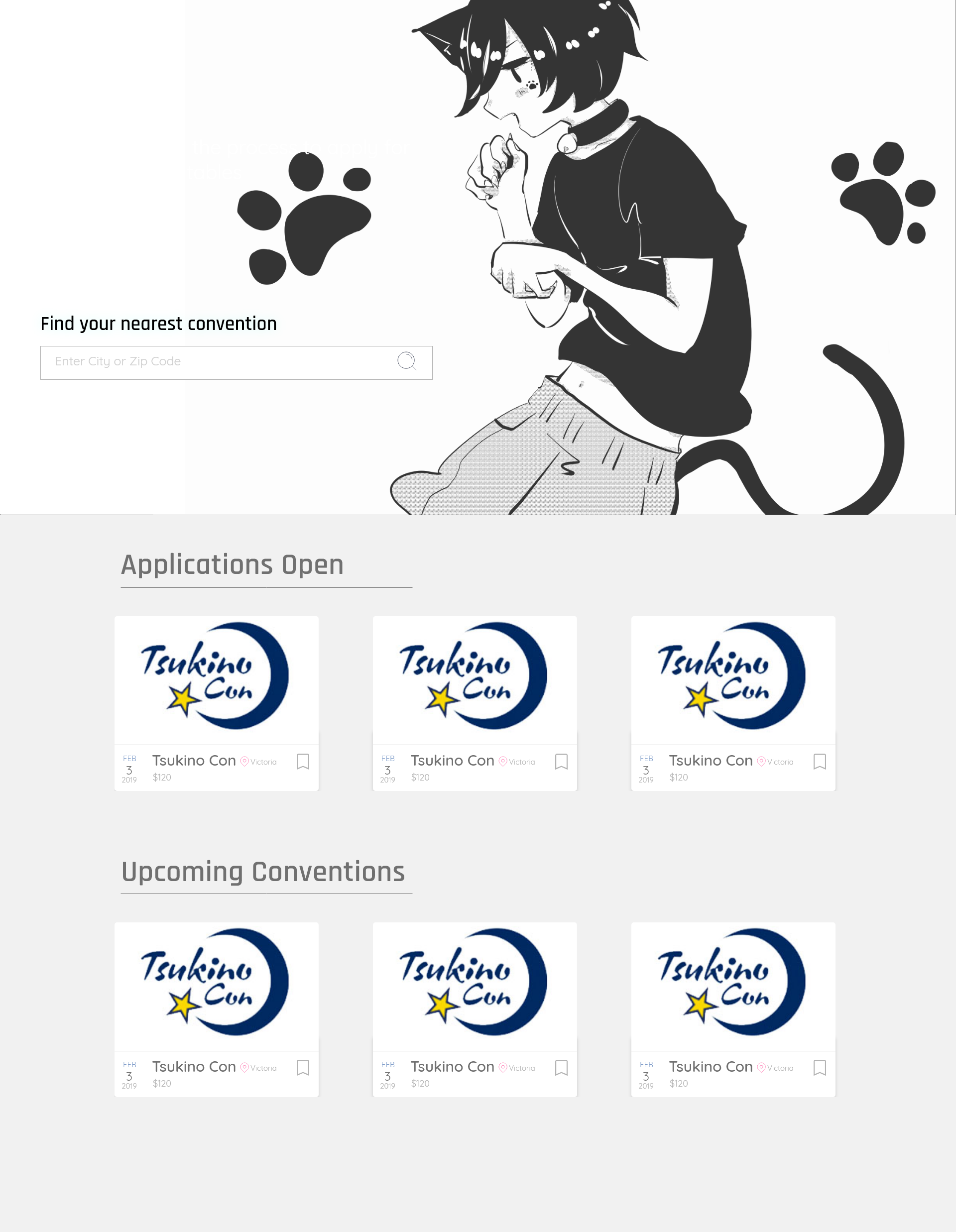
Getting a booth to sell at an anime convention is inefficient and stressful because an artist has to visit an infinite number of websites, find the page to apply for tables. Often table applications are not even open when they visit the site.
While Eventbrite is really great at catering an experience to the direct event attendees and organizers, the experience catered to vendors and artists was non-existent.
To create a better experience for artists wanting to apply for tables at anime conventions.
Artists usually have second jobs, often in retail or service, that does not allow them to use a cellphone when applications open.
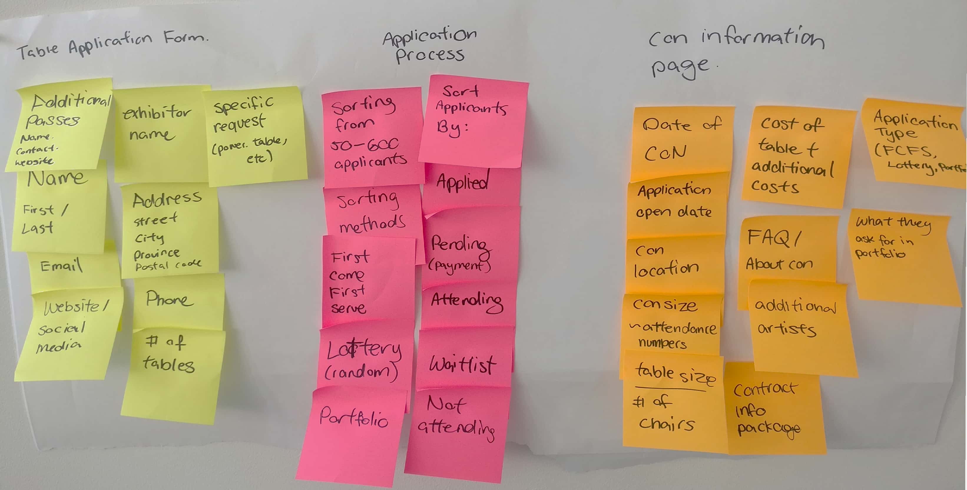
I started the project by interviewing several artists and organizers. I created an affinity map with the information that I obtained from them
My key learnings were:
1. Artist has no transparency towards when a convention will open their applications, as it's not the first thing advertised on the event website.
2. Finding the page to the application also takes time. If your lucky they will have maillist. If not, you have to check weekly. Put this at scale with 5+ conventions.
3. A lot of artist relies on discord or facebook community groups to get reminded when applications open.
4. This often happens 6 month before the event. Should artist miss it, it creates a painpoint with how much inventory they should order from the manufacturer.
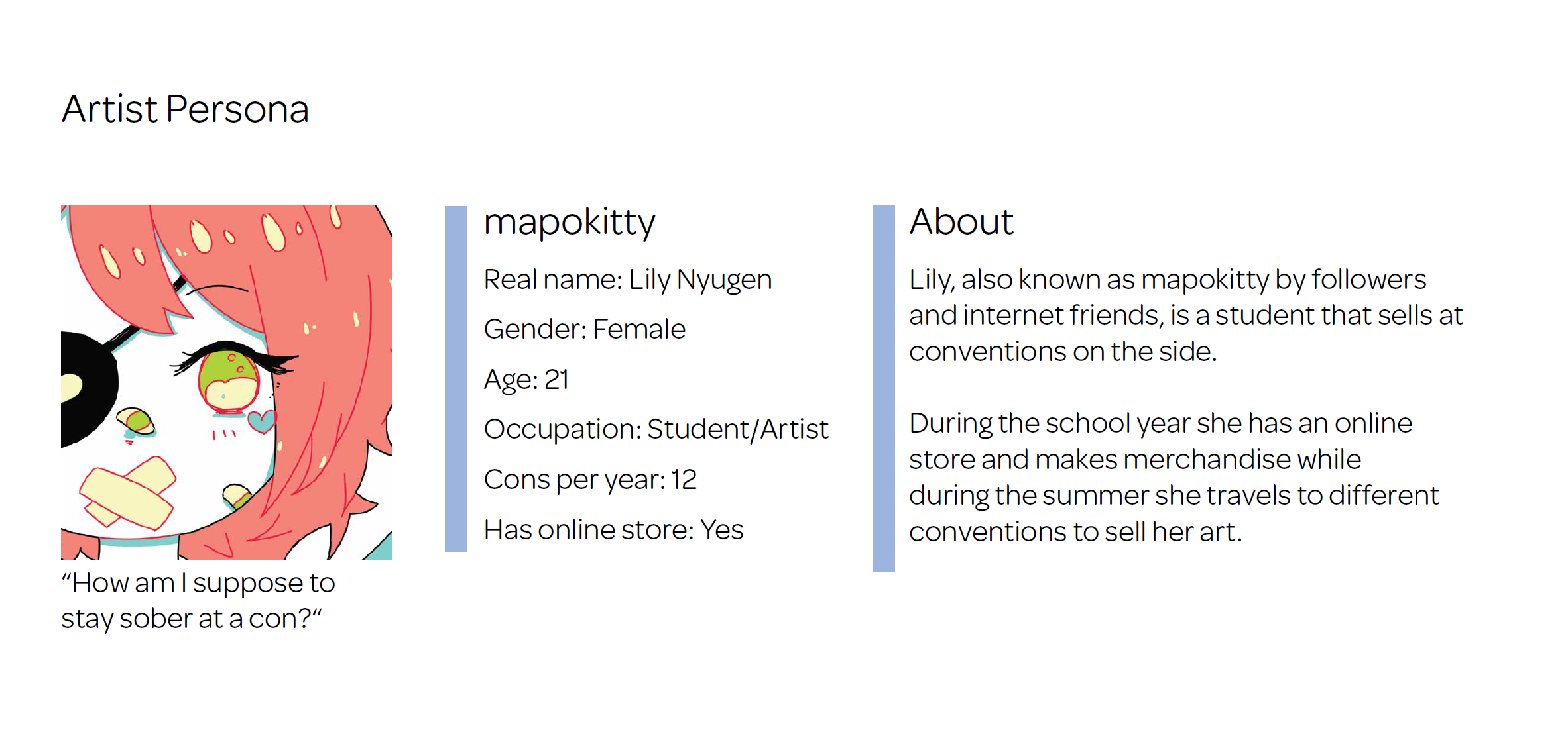
Previously being an artist, and knowing this space, I created the persona of the artist alley artist that travels throughout North America during convention season
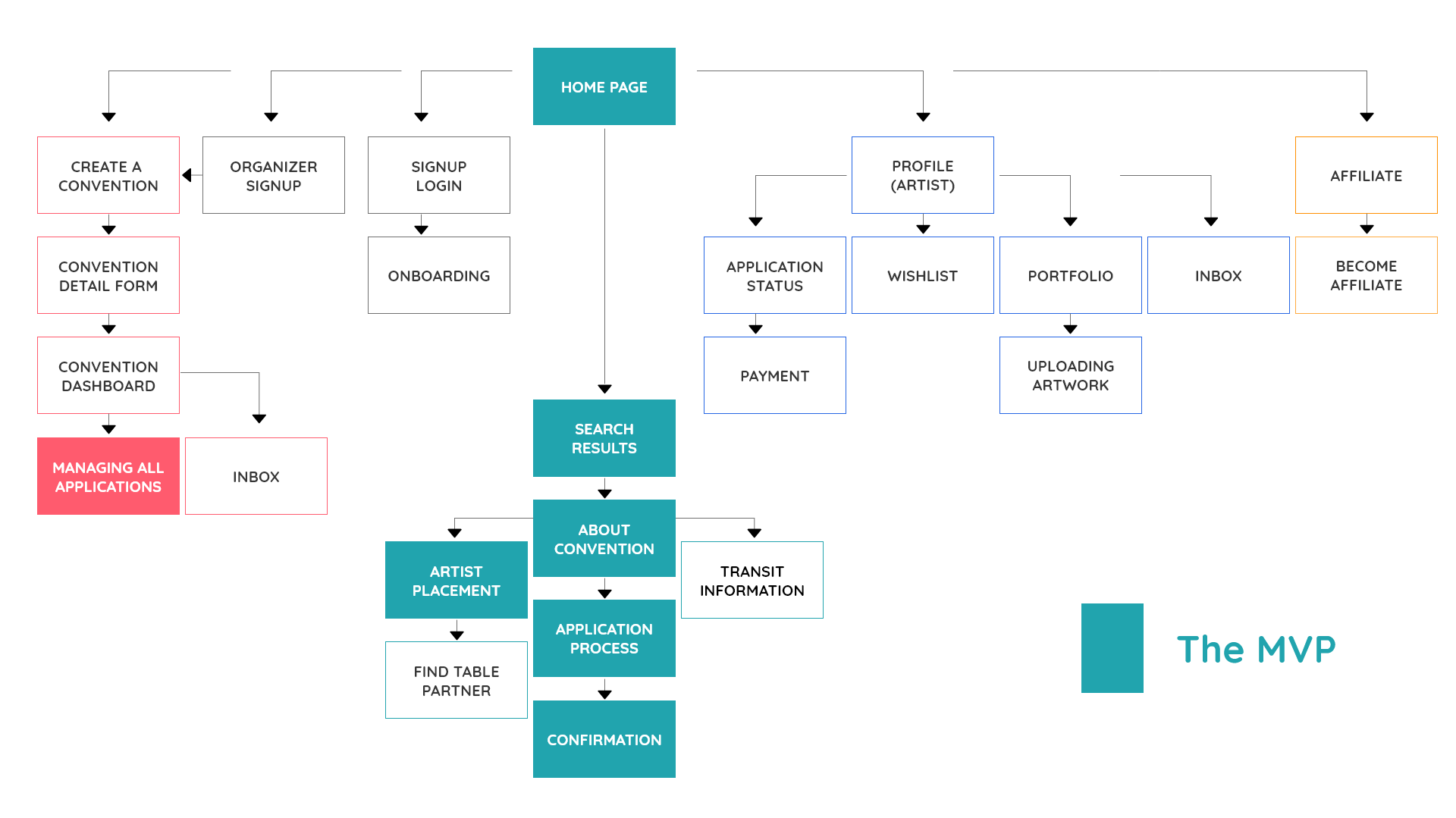
I made an information architecture to layout the structure of the website.
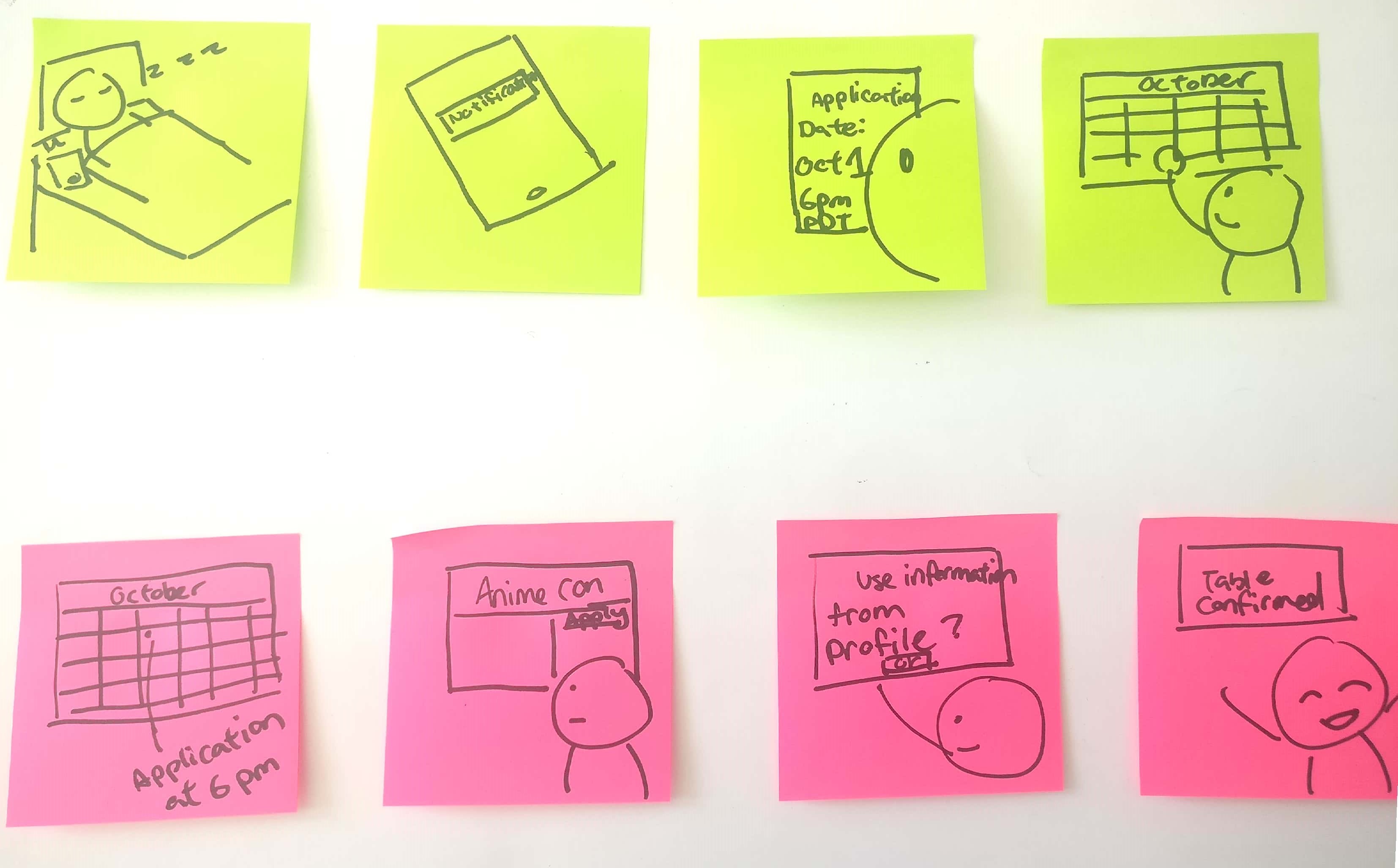
I drew out the scenerio storyboard of what I want the user to go through as an end result of this platform.
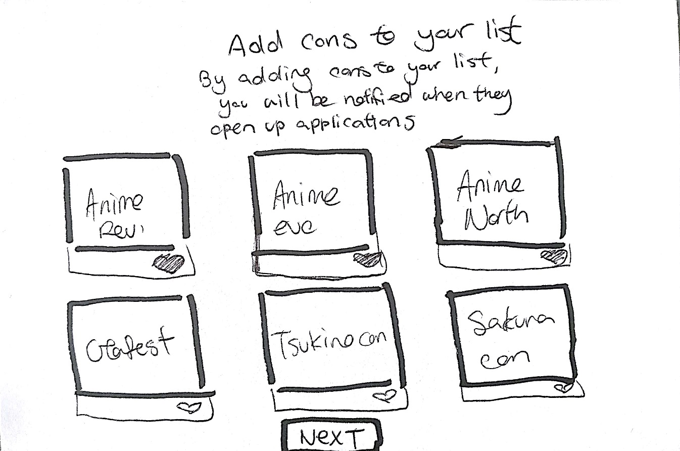
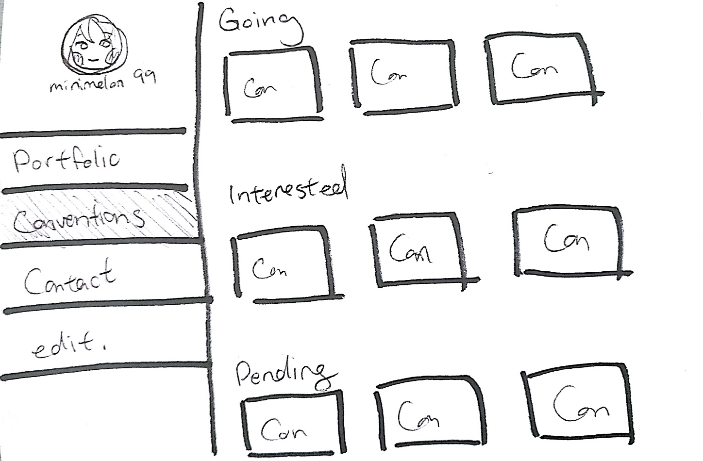
I drew out paper wireframes on Q cards and user tested them for quick feedback. The userflow was good, so I then created made a more high fidelity wireframes.
Userflow was good, but I got some feedback that it would be nice to see:
1. The artist alley layout
2. More information about the area, transit and where to stay as a lot of artists travel to sell.
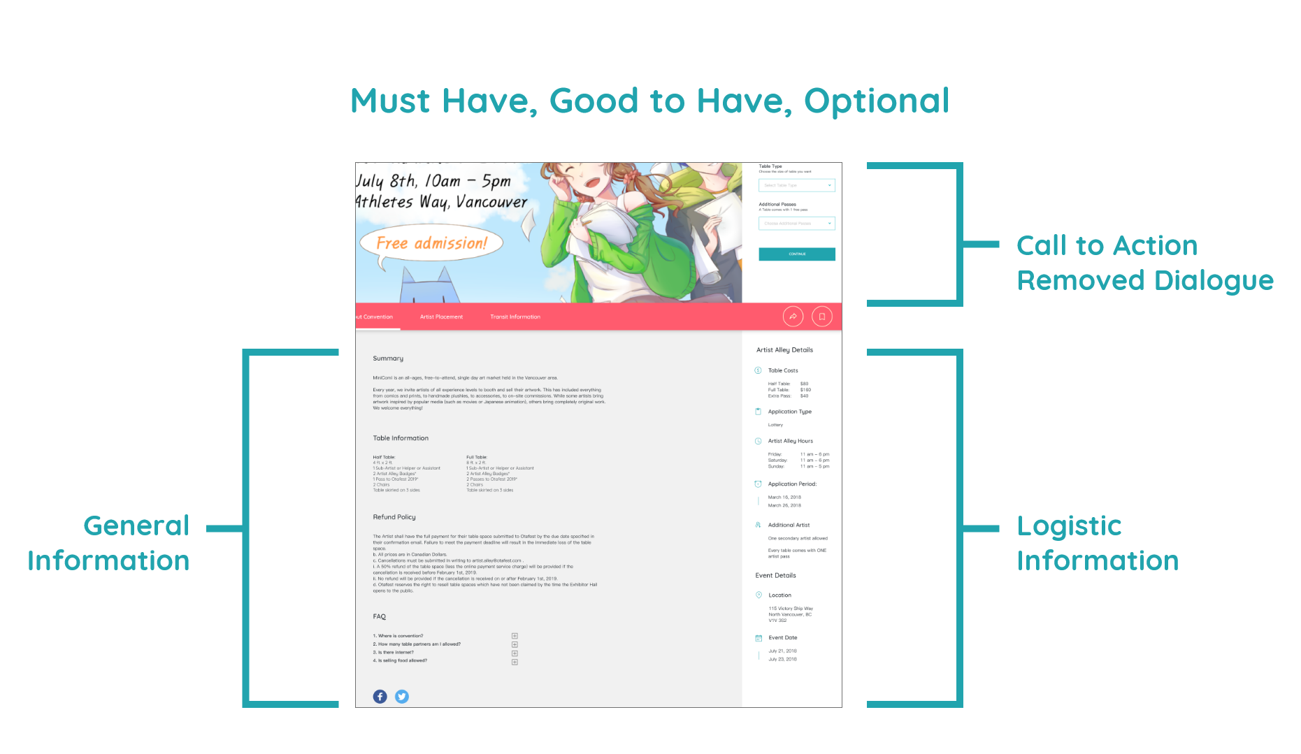
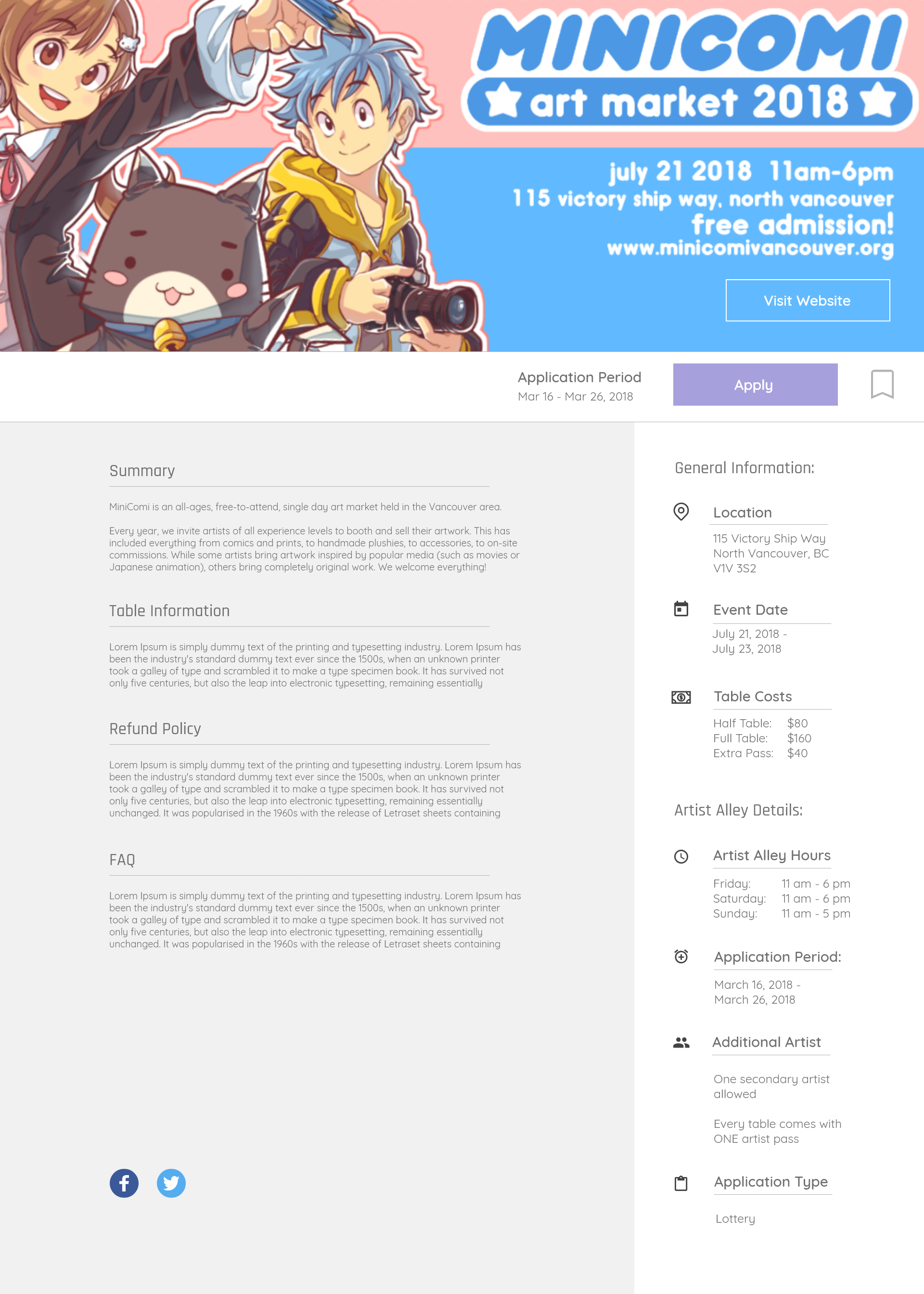
After sorting out the information that artists and organizers want, I asked them to rank the information into:
1. Must have: logistical information & policies
2. Good to have: more general information
3. Optional: Table layout and transit information
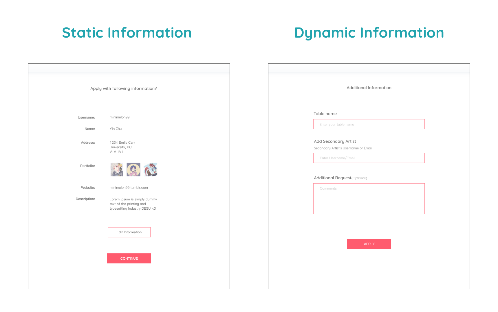
To decrease the time for artists to repeated enter the same information during the application process, I split them into two categories, the static and the dynamic information
Static Information being the information that never changes. Things like name, address, portfolio, website. All organizers need this information, and the user should not have to repeatedly input this information
Dynamic Information being the information that changes. Who your table partner is and what your table name will be is always something that constantly gets changed
This right here was the "AHA moment" I got from artists during usability testing
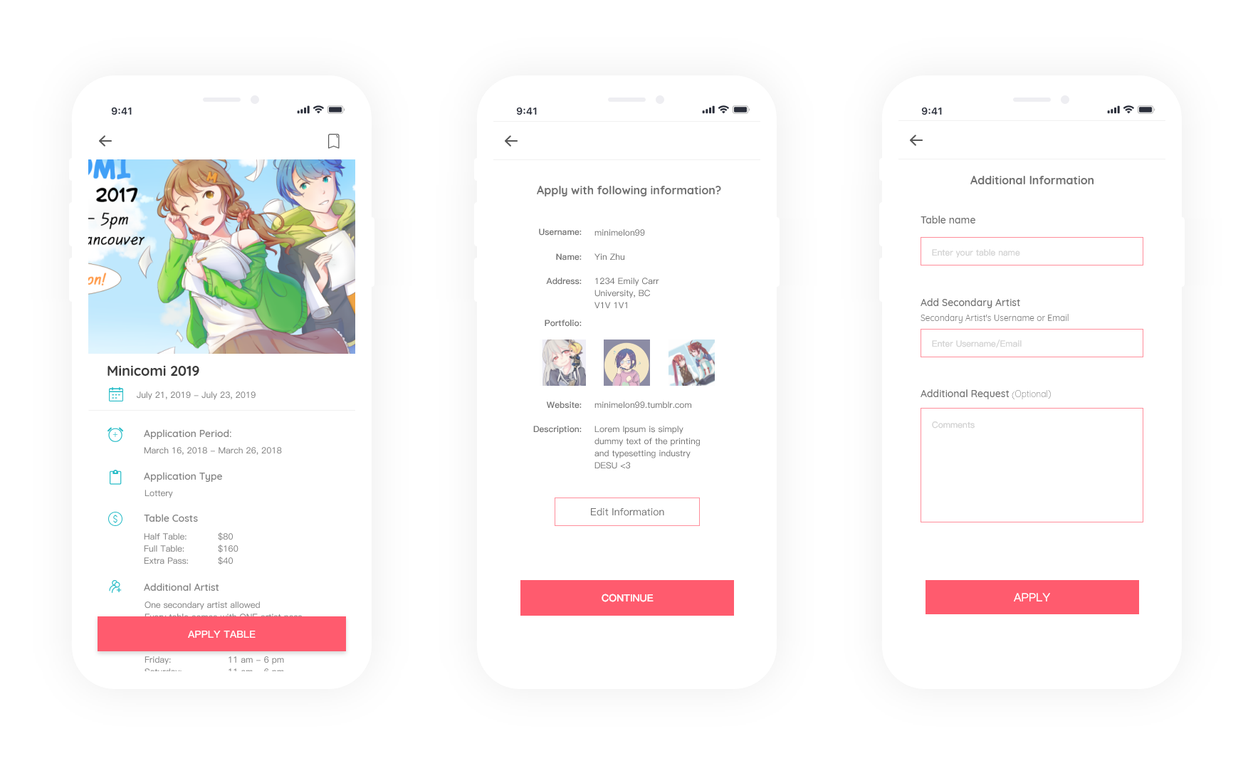
Application is also on mobile view as a lot of artists has other jobs in the service industry, and cannot easily access a computer. However, when I did my initial interviews, many artists would not apply for an application through their phones due to the fear of making mistakes.
Half way through the project, I learned about designing for accessibility, and realized that none of my colors passed accessibility criterias. I changed the colors that didn't pass the WCAG AA guidelines. The improved contrast ratio made the overall design better.
My key accomplishments through this project is:
1. Getting the AHA moment out of artists attending anime conventions, as this would save them a lot of anxiety with table applications.
2. Impressed the former CEO of Picatic, and was invited to their office.
After designing the first mock up iteration, I realized that the color choice I used was not accessible to the colorblind. This made me think more critically about my color choice, understanding that accessibility is not an after thought but rather should be considered at the start of my design process. Not only did it improve my design for those who are colorblind, it improved my design overall for everyone.
After doing countless usertesting, I learned that just because it was successful does not completely mean it was good. My users are tech literate but used to a tedious process. When there were certain features I was able to simplify, the “wow“ I saw on their faces was when I knew the “Aha!“ moment came.